
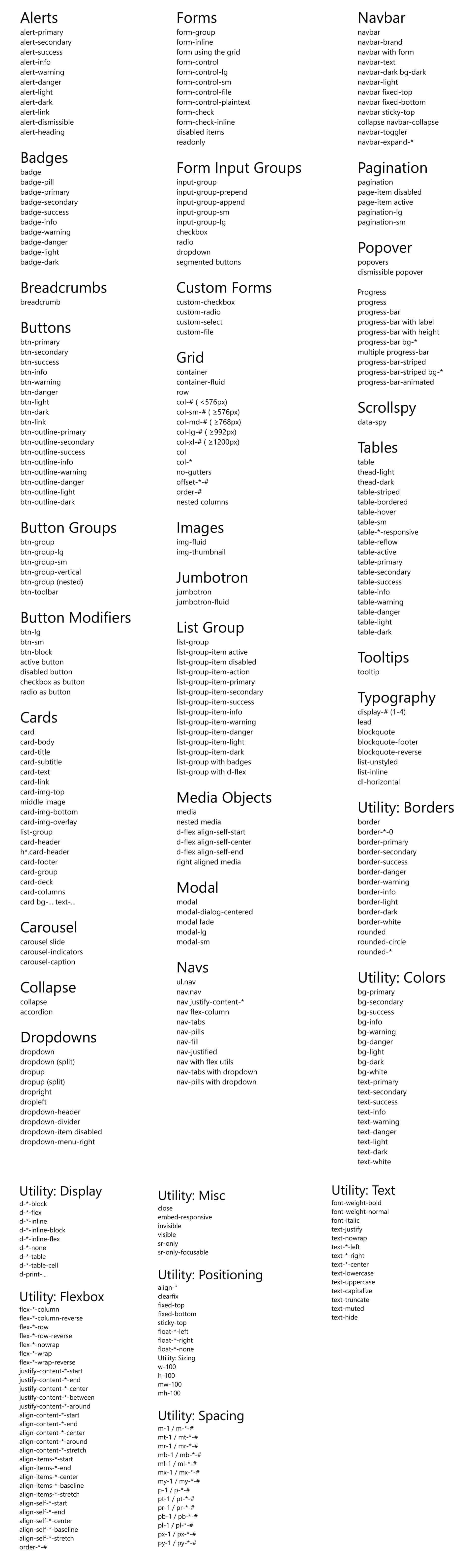
Bootstrap 4 Cheat Sheet - list of Bootstrap classes
Responsive breakpoints
// Extra small devices (portrait phones, less than 576px)
// No media query since this is the default in Bootstrap
// Small devices (landscape phones, 576px and up)
@media (min-width: 576px) { ... }
// Medium devices (tablets, 768px and up)
@media (min-width: 768px) { ... }
// Large devices (desktops, 992px and up)
@media (min-width: 992px) { ... }
// Extra large devices (large desktops, 1200px and up)
@media (min-width: 1200px) { ... }
// Extra small devices (portrait phones, less than 576px)
@media (max-width: 575.98px) { ... }
// Small devices (landscape phones, less than 768px)
@media (max-width: 767.98px) { ... }
// Medium devices (tablets, less than 992px)
@media (max-width: 991.98px) { ... }
// Large devices (desktops, less than 1200px)
@media (max-width: 1199.98px) { ... }
// Extra large devices (large desktops)
// No media query since the extra-large breakpoint has no upper bound on its width


Please login or create new account to add your comment.